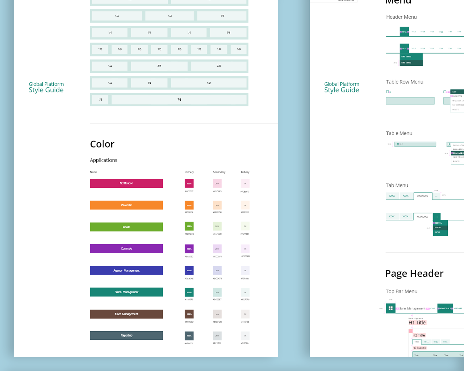
Table Usability Improvement and User Interface Redesign
Make it easier for users to find and access the information they need while improving the way data is presented in a table and make it easier for users to interact and complete tasks. This was a personal initiative that evolved into a tangible asset, implemented for company-wide use.
Solo Project • Research • UX Design • UI Design • Interaction Design • Wireframe • Prototype
More Than Just UI Redesign
Redesigning the UI to improve user-friendliness is essential, but understanding how people use the app daily is even more important. By improving the UX, I aimed to increase user satisfaction, engagement, productivity, and retention.


Conducting Survey and User Interviews to Understand the Challenges and Frustrations
By engaging users in a series of insightful conversations, I gained a deep understanding of the pain points and frustrations experienced by users when interacting with table layouts embedded in National General Insurance’s digital products and services. These insights ensured that the revamped table layouts would align with user needs and expectations.

- 1
What specific tasks or functions do you perform within the application that involve table layouts?
- 2
How frequently do you use the application that involve table layouts, and for what purpose?
- 3
What aspects of the current table layout design do you find frustrating or challenging?
- 4
How do the table layouts affect your productivity or efficiency when using the application?
- 5
Are there any particular features or functionalities in the tables that you find confusing or unclear?
- 6
Have there been instances where you needed to export or print data from the tables, and the process was less than ideal?
- 7
Can you recall any specific incidents where you were not able to complete a task or had to spend an excessive amount of time due to the table layout’s limitations?
- 8
Are there features or functionalities you believe are missing from the table layouts that would enhance your user experience?
- 9
In your opinion, how does this outdated table design affect your overall satisfaction the application?
- 10
Do you believe that modernizing the table layouts would improve your user experience? If so, how?
- 11
Can you suggest any specific changes or improvements that you would like to see in the table layouts to address your challenges and frustrations?
By actively listening to users’ feedback, I identified recurring themes that highlighted the shortcomings of the existing table layouts. These frustrations stemmed from outdated design principles, inconsistent formatting, and a lack of features available, and many more.
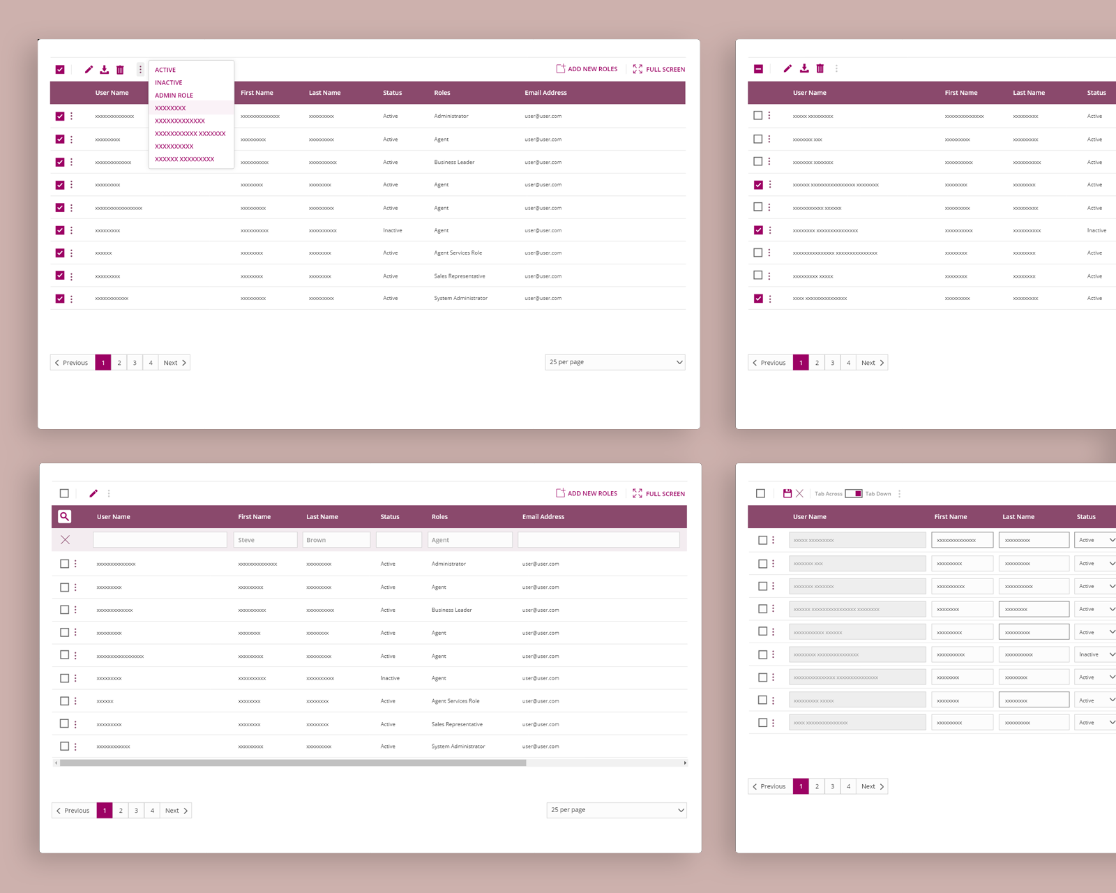
Areas of Focus for Redesigning Table Layout
Crafting Low-Fidelity Wireframe to Validate the Solution

Prototype User Testing After Several Design Iterations

A Success Story in UI Enhancement and Productivity Boost
The new table design was implemented incrementally throughout the NGIC eco-system. It coexists with the old legacy layout in certain areas, while being featured on newly built pages that incorporate the latest UI patterns and elements. After a thorough observation period of 4 weeks, it was revealed that the new design had a profound impact on productivity, resulting in a remarkable increase of over 60%. The findings demonstrated the effectiveness of the new table design, validating its successful integration into the NGIC eco-system.
Work
PROBLEM SOLVING • UX • UI • VISUAL DESIGN
VIEW PROJECTemp08242023-11-26T07:56:58+00:00
VIEW PROJECTemp08242023-11-26T07:57:23+00:00
VIEW PROJECTemp08242023-11-26T07:57:50+00:00
VIEW PROJECTemp08242023-11-26T08:11:20+00:00
VIEW PROJECTemp08242023-12-01T14:30:15+00:00