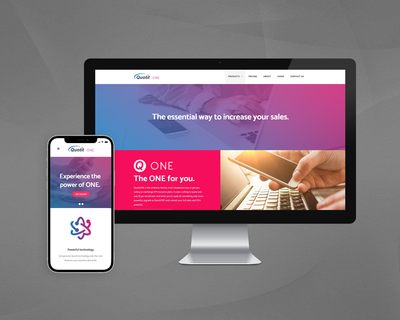
QuotitGo Redesign
QuotitGo version 2.0 introduces enhancements to improve the overall user experience, making the app more user-friendly, intuitive, and engaging. I primarily focused on improving two main aspects of the product: quote management and the quoting process.
Team Lead • Research • IA • User Flow • UX Design • Wireframe • UI Design • Visual Design • Prototype
I Was Assigned to Lead a Complete Overhaul
I took into account user feedback and preferences to develop a design that fulfills the requirements and expectations of NGIC agents. The objective of the project was to enhance agent participation and utilization of the app.


“What Was the Business Goal of QuotitGo 1.0 and Why Did It Not Succeed?”
Was the first thing I tried to find out, so I reviewed documents and meeting records. After reviewing documents and interviewing key stakeholders involved with the project, I found out that the primary cause of downfall stemmed from significant communication challenges during collaboration with the third-party responsible for its development. This resulted in a less-than-ideal product that did not fully meet user needs and expectations. Acknowledging these shortcomings and learning from them, we were able to identify areas for improvement and set new goals with a renewed focus on delivering a successful product.

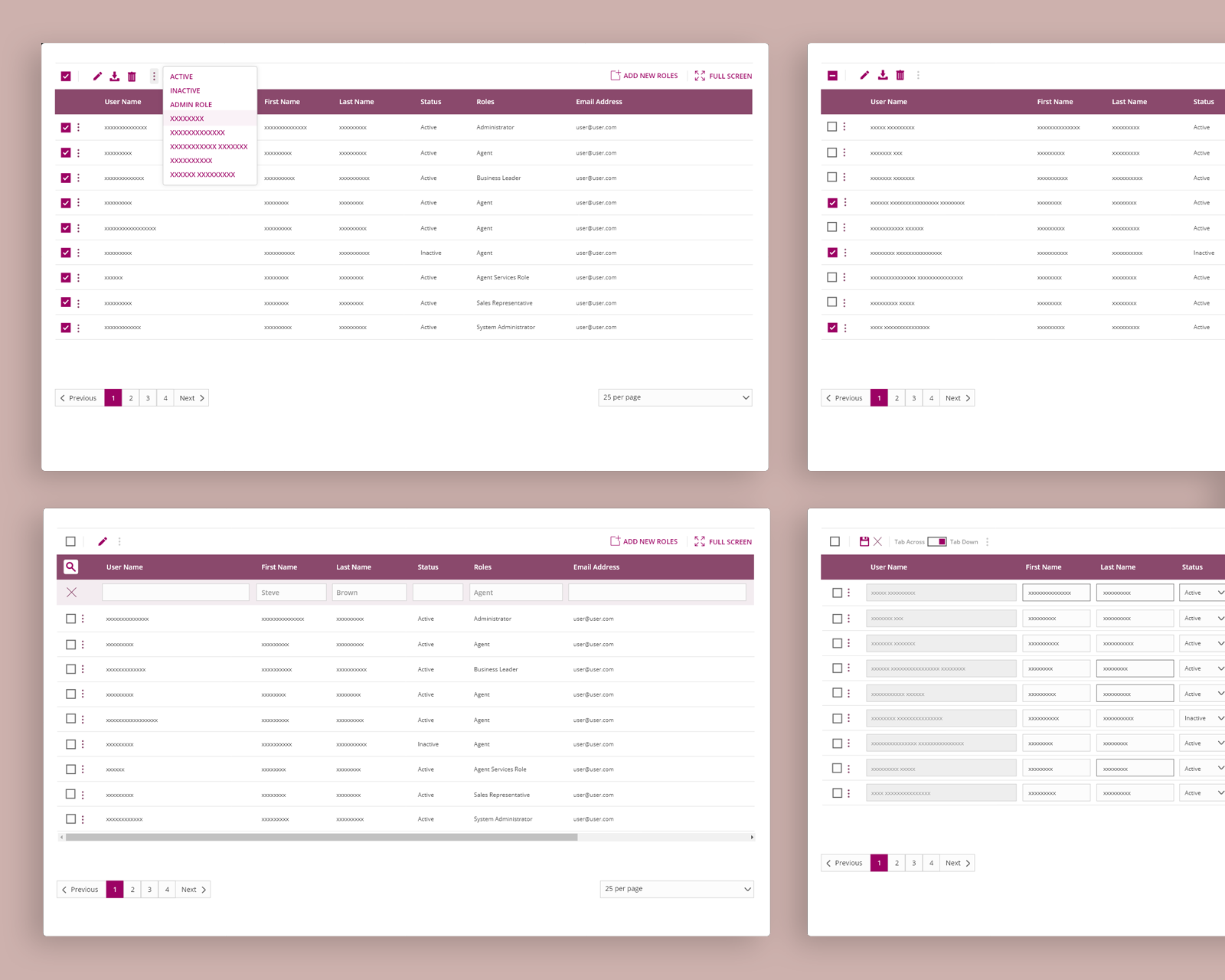
The Team Gained Clearer Insights Into the Problems That Need to Be Addressed
We conducted one-on-one and group interviews and surveys with in-house stakeholders, as well as members of outside agencies, to collect in-depth feedback on the existing mobile application.

A Glance at the Competitions to Validate Our Strategy
After examining some of the leading mobile applications for health insurance quoting in 2023 and taking into account feedback from active users to evaluate their usability strengths and weaknesses, we identified areas of focus.

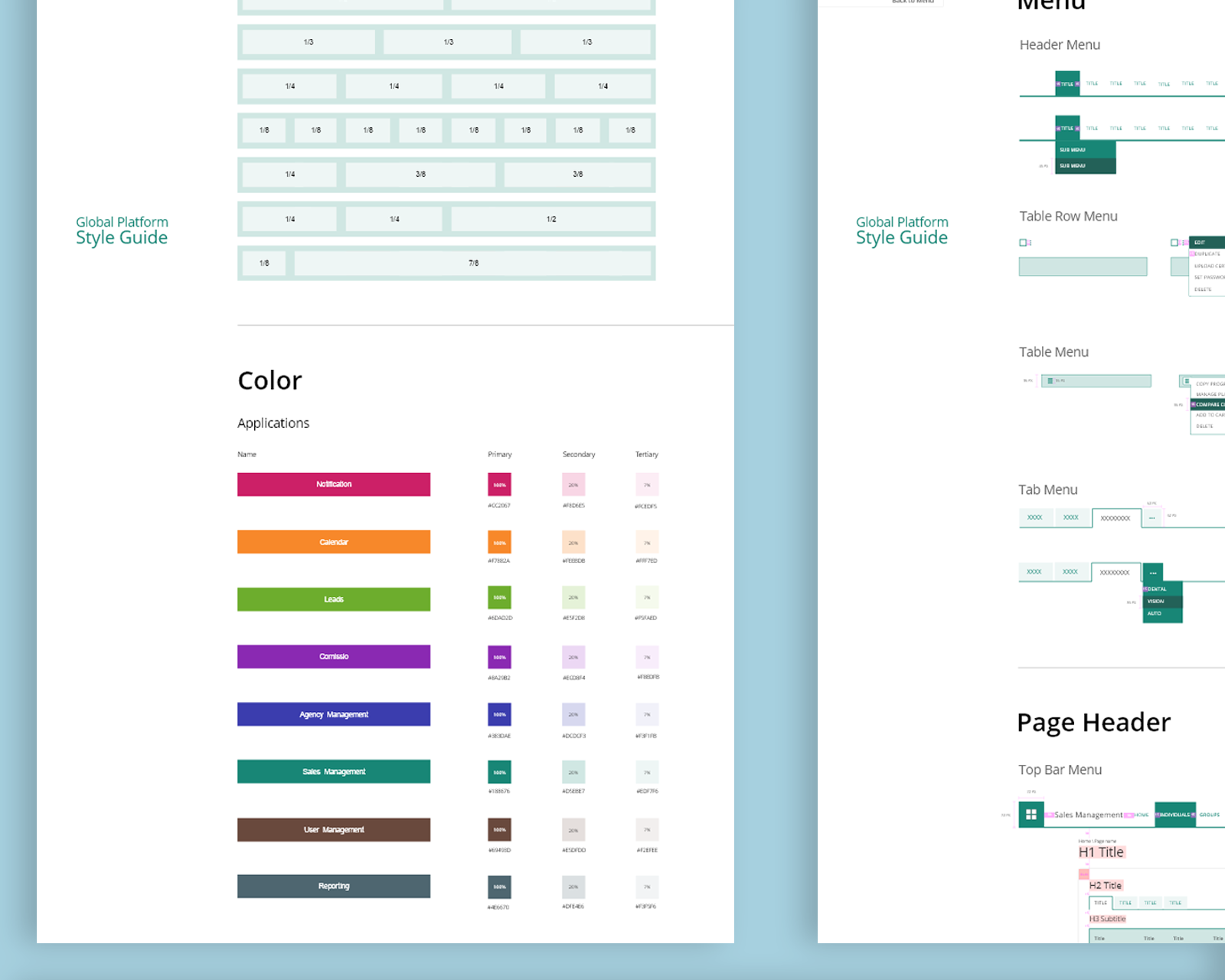
Key Ideas We Focused On

In order to maximize efficiency, we made the deliberate choice to design a single-page sign-up form that is concise and straightforward. This decision was influenced by our assumption that potential users already possess industry knowledge and have a clear understanding of their motivations for joining.
Clarifying the Details and Creating a Low-Fidelity Wireframe
By opting for a shorter and more streamlined process, we aimed to minimize any unnecessary steps or complexities that could potentially hinder user engagement. Our goal was to create an efficient and seamless experience, tailored specifically to the needs and expectations of our target audience.
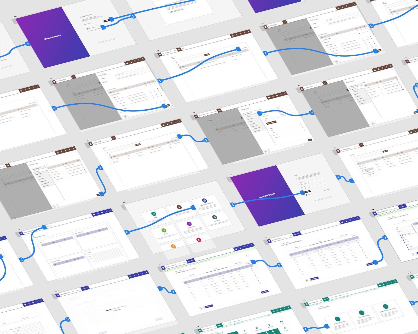
User Flow Diagram for the Onboarding, Account Management, Customer Management, Quoting, and Quote Management Processes

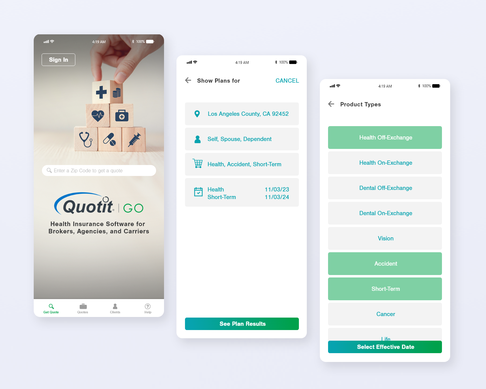
Wireframe for the Quote Process

Crafting a High-Fidelity Prototype for User Testing
A total of 27 agents, aged between 36 and 55 years old, participated in user testing.

96% of participants Experienced Significant Improvement After the Redesign
26 agents expressed their intention to start using it immediately upon availability. Additionally, we gained valuable insights into areas that need improvement based on the feedback received during testing. Here are some key takeaways:
In Response to This Valuable Feedback, We Took the Following Steps to Further Improve the App:


The bottom navigation is displayed only on high-level views, ensuring a more focused user experience during specific tasks. We added a dedicated section on the send proposal page where users can include their phone number and email information.


We made the decision to display census information on top of the plan result page to provide users with access to relevant data and insights during the plan selection process. Additionally, we incorporated the ability to edit the census info as well.
What’s Next?
Regrettably, despite our best efforts, a business decision was made to redirect our focus and cancel the project due to restructuring of available company resources before we could collect real-world success metrics that would have provided valuable insights into the effectiveness of our redesign. While the product did not materialize, we learned a wealth of valuable information that may be useful for future projects.
Work
PROBLEM SOLVING • UX • UI • VISUAL DESIGN
VIEW PROJECTemp08242023-11-26T07:56:58+00:00
VIEW PROJECTemp08242023-11-26T07:57:23+00:00
VIEW PROJECTemp08242023-11-26T07:57:50+00:00
VIEW PROJECTemp08242023-11-26T08:11:20+00:00
VIEW PROJECTemp08242023-12-01T14:30:15+00:00